Monday, June 14, 2010
Wednesday, May 5, 2010
 (Project 9)
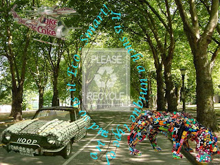
The theme was "Eco-Smart Art."
In this project i tryed to make it into a gallery of recycling art through a "green" street. I took the dog made of different colorful toddler toys, a convertible car made out of cans, and the helicopter madde out of cans too. I added a luminosity mode to the convertible car. I made my own custom brush of a sign saying "Please Recycle'' and the recycle symbol. I wrote "It is such a unique type of art and so is it Eco-Smart!" I made the font a tealish color. Basically it's showing how art and recycle can come together to form something incredible that is very beautiful, outstanding, and helpful to our world, Earth.
Wednesday, April 28, 2010
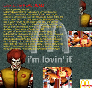
 This project was the most difficult project i have done through out the whole term, so far. It was difficult because of the reflection. As viewable, i really did not add a reflection as wanted to be seen as. I just flipped the photography of the obesity kid eating McDonalds. It didn't have much of work to be made. The layer gradient was basically done for me, since i did not understand how it could have been made. The custom brush was made by myself, i didn't think twice in choosing a smaller McDonalds logo because since it's the first time i make one. The background is a layer pattern i choose to make it more decorative. My research was basically what i know about McDonalds and the research i did.
Wednesday, April 14, 2010
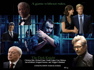
 (Project 7) I used 10 different layers. All photographs were cut out and masked. Besides the joker one, the joker one is the actual background with joker in it. I tended to make the "a game without rules" into a swampy green so the picture wont look bad and lose is image by choosing another bright color. As well with "The Dark Knight" i used the same color for the same reason as well. I had a difficulty with one of the actors photograph because i could fit it in and i already added the name thats in the white letters.
Thursday, March 25, 2010
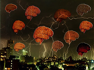
 (Project 6) In this picture i added a background of Sydney, Australia. I added ten human brains to make it look like a "Brain Storm". I edited the Brightness/Contrast to the background picture. To all the brains i added at least two blending options for each. I also put a different layer mode to each brain. That's how my "Brain Storm" was created.
Thursday, March 18, 2010
 (Project 5) I used a landscape of the surface of mars and 4 other pictures to make this science fiction image. For the Empire State Building, i used the multiply mode which made it have a dark reflection and didn't really take away the image of the empire state building. For the alien I used the color burn mode that made it have a reflection and the color of black and red that really does look like if it was "burnt". For the flying Ferrari car i used the luminosity mode which made it have the same color transparent color that is a dull brown color. For the two soccer players i used the hard mix mode, this mode didn't really make them be transparent but it sort of made it have a color burn like the alien.
Subscribe to:
Comments (Atom)


